
Section 5.7.1 · Chapter 5: Buttons and Switches
Multistate Switch - Basic Operations
A multi-state switch can be configured to perform as one of the following types of controls:
By default, the list box lists the text of all states of the switch one state per line starting from state 0. The text of the current state is highlighted. If the desired state is not in view, you can use the scroll bar attached to the right side of the list to scroll the text. When you select a desired state by touching its text, the switch writes the value of the selected state to the specified variable and closes the list box.
|
Control Type |
Description |
|---|---|
| Button | The multi-state switch is a push button. It changes the state of the specified variable to the next state when it is touched. Note: The next state is not necessarily the current state plus one. |
| List |
By default the multi-state switch is a list box. It lists the text
of all the states of the switch one state per line
starting from state 0 as shown in the following example.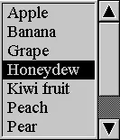 The text of the current state is highlighted. If the desired state is not in view, you can use the scroll bar attached to the right side of the list box to scroll the text. If the tabular list is checked, the multi-state will lists the text of all the states in column-wise tabular format starting from start 0 as shown in the following example.  The text of the current state is highlighted. When you select a desired state by touching its text, the list box writes the value of the selected state to the specified variable. |
| Drop-down List |
The multi-state switch is a drop-down list. It displays
the text of the current state and a button with the down
arrow symbol as shown in the following example.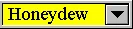 When the button is touched, the switch list displays a list box or a tabular list if selected beneath itself as shown in the following examples. 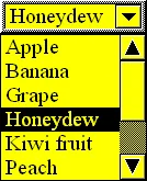
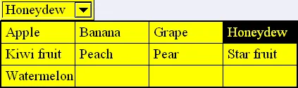 When you select a desired state by touching its text, the switch writes the value of the selected state to the specified variable and closes the list box. 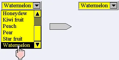 If you want to cancel the operation when the list box is showing, touch anywhere other than the text in the list box or a tabular list. Note: About the difference between a list box and a tabular list, please see detail explanation in List control type. |
| Throw-up List |
The multi-state switch is a throw-up list. It displays
the text of the current state and a button with the up
arrow symbol as shown in the following example.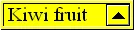 When the button is touched, the switch list displays a list box or a tabular list if selected above itself as shown in the following example. 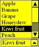
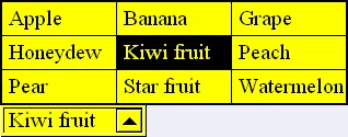 When you select a desired state by touching its text, the switch writes the value of the selected state to the specified variable and closes the list box. 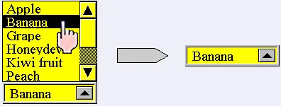 If you want to cancel the operation when the list box is showing, touch anywhere other than the text in the list box. Note: About the difference between a list box and a tabular list, please see detail explanation in List control type. |
Need PM Designer itself?
V4 for current PK, PT, ITV and PM panels, V2 for older models. Free, sent by email.
Source.Section 5.7.1 of the PM Designer Software User Manual, Edition 2.0, © Cermate Technologies Inc. (www.cermate.com, service@cermate.com). Reproduced online, with the manual's own figures, by TSL Automation Solutions, authorised Cermate distributor, for users of Cermate HMI panels. PM Designer and PanelMaster are trademarks of Cermate Technologies Inc.
Text and figures are the manufacturer's and may describe features your panel or software version does not have. For a plain-language introduction read the PM Designer guide; for help with a specific panel contact TSL Automation.