
Section 5.8.4 · Chapter 5: Buttons and Switches
Radio Button Group - General Settings
This section describes how to define the general settings for a radio button group. The following is an example of the General page of the Radio Button Group property sheet.
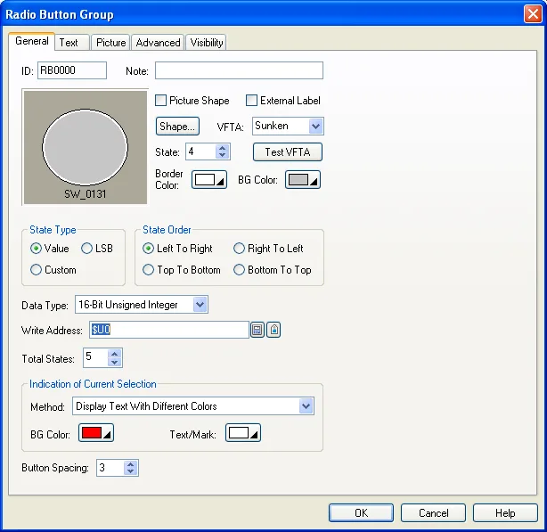
The following table describes each property in the General page.
|
Property |
Description | ||
|---|---|---|---|
| ID | The object’s identifier. It is generated when the object is created. The identifier is unique within the screen where the object is located. The format of the IDs for radio button groups is RBnnnn. | ||
| Note | You can type a note for the radio button group. | ||
| Shape settings |
For details about the following properties, see
Section 4.3.4 Setting up the Shape of an Object.
Picture Shape,
 ,
VFTA,  ,
Border Color, BG Color. |
||
| External Label | Check this option if you want the radio button group to have an external label. Set up the external label in the External Label page. | ||
| State |
Specifies the current state of the radio button group.
You can set the appearance of the button associated with
the current state. Note: Although you can set the appearance for the button of the current state, you cannot view all the changes immediately. This is because the button is highlighted with the BG color and the text color set for the Current State. You can change the current state so the button is shown with new settings instead of being highlighted. |
||
| State Type | The state type of the controlled variable. There are three options: Value, LSB, and Custom. For details, see Section 4.4.1.1 State Types. | ||
| State Order | Specifies how to arrange the radio buttons. There are four kinds of order: | ||
| State Order | Description | ||
| Left to Right | The buttons are arranged in order, in a row with the button of state 0 at the left most position. | ||
| Right to Left | The buttons are arranged in order, in a row with the button of state 0 at the right most position. | ||
| Top to Bottom | The buttons are arranged in order, in a column with the button of state 0 at the top position. | ||
| Bottom to Top | The buttons are arranged in order, in a column with the button of state 0 at the bottom position. | ||
| Data Type | The data type of the variables specified in this page. | ||
| Write Address | Write Address | Specifies the variable to be controlled. | |
 |
Click this icon to bring up the Address Input Keypad and specify an address for this property. | ||
 |
Click this icon to bring up the Select Tag dialog box and select a tag for this property. | ||
| Total States | Specifies the number of valid states that the controlled variable has. | ||
| Custom State Value | Click this button to define the state value for each state when the State Type is Custom. For details, see Section 4.4.1.2 Setting the Custom States of an Object. | ||
| Indication of Current Selection | Method | Choose the method from Display Text With Different Colors, Use Round Mark or Use Square Mark to indicate the current selection. | |
| BG Color | The color to replace the shape’s BG color when selected. | ||
| Text / Mark | The color to replace the text or mark color when selected. | ||
| Button Spacing | The distance in pixels between two adjacent radio buttons. | ||
Need PM Designer itself?
V4 for current PK, PT, ITV and PM panels, V2 for older models. Free, sent by email.
Source.Section 5.8.4 of the PM Designer Software User Manual, Edition 2.0, © Cermate Technologies Inc. (www.cermate.com, service@cermate.com). Reproduced online, with the manual's own figures, by TSL Automation Solutions, authorised Cermate distributor, for users of Cermate HMI panels. PM Designer and PanelMaster are trademarks of Cermate Technologies Inc.
Text and figures are the manufacturer's and may describe features your panel or software version does not have. For a plain-language introduction read the PM Designer guide; for help with a specific panel contact TSL Automation.