
Section 5.3.4 · Chapter 5: Buttons and Switches
Screen Button - General Settings
This section describes how to define the general settings for a screen button.
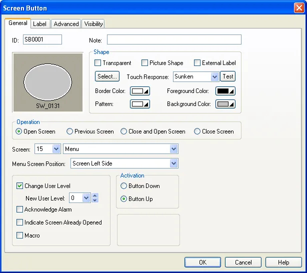
The above is an example of the General page of the Screen Button dialog box.
The following table describes each property in the General page.
|
Property |
Description | ||
|---|---|---|---|
| ID | The object’s identifier. It is generated when the object is created. The identifier is unique within the screen where the object is located. The format of the IDs for screen buttons is SBnnnn. | ||
| Note | You can type a note for the object. | ||
| Shape settings |
For details about the following properties, see
Section 4.3.4 Setting up the Shape of an Object.
Transparent, Picture Shape,
 ,
Touch Response,  ,
Border Color, Pattern, Foreground Color, Background Color |
||
| External Label | Check this option if you want the bit button to have an external label. Set up the external label in the External Label page. | ||
| Operation | Specifies the operation that you want the screen button to perform. There are four choices: Open Screen, Previous Screen, Close and Open Screen, and Close Screen. For details, see Section 5.3.1 Basic Operations. | ||
| Screen | Specifies the screen to be opened. | ||
| Menu Screen Position | Select one of the following 6 positions for the specified menu screen to be displayed. This field will be displayed only when the specified screen is a menu screen. | ||
| Position | Description | ||
| Screen Left Side |
The menu screen slides into view horizontally from the
left side of the screen.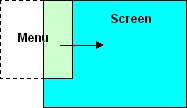 |
||
| Screen Right Side |
The menu screen slides into view horizontally from the
right side of the screen. 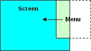 |
||
| Button Left Side & Downward |
The menu screen appears on the left side of the button
and slides downward into view. 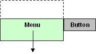 |
||
| Button Left Side & Upward |
The menu screen appears on the left side of the button
and slides upward into view. 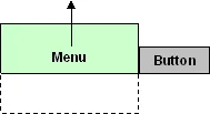 |
||
| Button Right Side & Downward |
The menu screen appears on the right side of the button
and slides downward into view.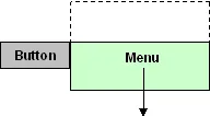 |
||
| Button Right Side & Upward |
The menu screen appears on the right side of the button
and slides upward into view.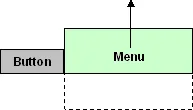 |
||
| Change User Level | <Check Box> | Check this option if you want the button to change the current user level. | |
| New User Level | The new user level to replace the current user level. | ||
| Acknowledge Alarm | Check this option if you want the button to acknowledge the associated alarm of the screen where the button is located. You can configure an alarm to display an (alarm) screen. The alarm is then the screen’s associated alarm. | ||
| Indicate Screen Already Opened | Check this option if you want the button to indicate the specified screen is already open. | ||
| Macro | Check this option if you want the button to have a macro. Specify and edit the macro in the Macro page. | ||
| Activation | Button Down | Specifies that the touch operation is activated when the button is pushed. | |
| Button Up | Specifies that the touch operation is activated when the button is released. | ||
| Key | The hard key that is used to operate the object. This item is available only when the target panel has hard keys. | ||
| Touch Operable | Check this option if you want the button is still operable by using the touch panel even it is configured to be operated by the key. | ||
Need PM Designer itself?
V4 for current PK, PT, ITV and PM panels, V2 for older models. Free, sent by email.
Source.Section 5.3.4 of the PM Designer Software User Manual, Edition 2.0, © Cermate Technologies Inc. (www.cermate.com, service@cermate.com). Reproduced online, with the manual's own figures, by TSL Automation Solutions, authorised Cermate distributor, for users of Cermate HMI panels. PM Designer and PanelMaster are trademarks of Cermate Technologies Inc.
Text and figures are the manufacturer's and may describe features your panel or software version does not have. For a plain-language introduction read the PM Designer guide; for help with a specific panel contact TSL Automation.