
Chapter 5 of 13 · PM Designer guide
Screens and objects in PM Designer: buttons, switches, lamps and data entry
A PM Designer application is a set of screens, and each screen is a set of objects. Normal screens fill the display one at a time, window screens pop up over them, and menu screens slide in from an edge. Objects fall into a few families: buttons and switches that write to the PLC, lamps and message displays that show a state, numeric and character entries and displays for values, and drawing shapes for decoration. Every object has the same property sheet layout, so once you know one you know them all.
Applies to PM Designer V2.1 and V4.0Updated 11 Nov 2026Manual reference: Sections 3.9, 4.4 and Chapters 5, 6, 7
Three kinds of screen
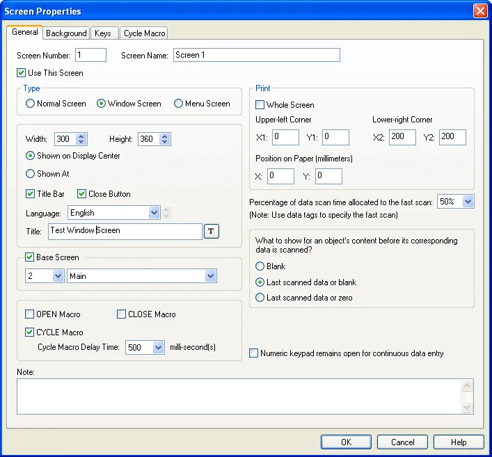
Create screens with Screen > New Screen; each needs a unique number (1 to 7,999) and name (Section 3.9). The Type on the Screen Properties General page decides how it behaves (Section 3.9.1):
- Normal screen (main screen): fills the display; only one is shown at a time, and the panel remembers the last 32 so a Previous Screen button works. The start-up screen must be one of these.
- Window screen: a smaller screen that opens on top of the main screen, at the centre or at an X and Y you set, with an optional title bar and close button. Opened by a screen button, by an alarm, by a page selector, by the
OPEN_WSmacro, or automatically as a custom keypad. Several can be open at once, and a window with a title bar can be dragged. - Menu screen: a window that slides in from one of six positions when its screen button is pressed, for navigation bars and side menus.
The Background page fills the screen with a colour, a pattern or a picture. The Open, Cycle and Close Macro pages attach code to the screen's lifetime, and on key-type panels the Keys page assigns the hardware keys. Screens can be exported as SNF files and imported into any project regardless of panel size, copied and pasted between applications, saved as pictures for documentation, and password-protected against editing (Sections 3.9.4 to 3.9.7).
The anatomy of an object
Place an object from the Object menu or toolbar, click on the screen, then double-click it to open its property sheet. The pages are consistent across objects (Section 4.4):
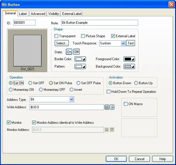
- General: the ID (BB0001 for a bit button, NE0001 for a numeric entry and so on), the shape (a graphical shape from the palette or a picture shape from the picture database, with border, pattern, foreground and background colours per state), and the operation and addresses.
- Label or Text and Picture: the inner text and picture, per state and per language, with font templates.
- Advanced: touch operation control (enabled by a bit or by the current user level), minimum hold time, operator confirmation with a timeout, a notification bit raised when the operation completes, and operation logging.
- Visibility: always invisible (but still touchable, for hidden buttons), shown or hidden by a bit, or by user level; the page also holds the exact position and size in pixels.
- External Label: a caption outside the object.
- Macro pages where the object supports On, Off or Object macros.
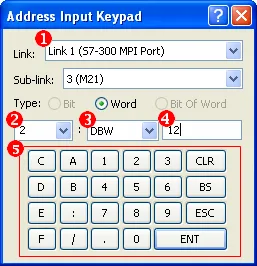
Objects that monitor a bit have two states; objects that monitor a word can have up to 256, decided by a state type (Section 4.4.1.1): Value uses the word's value directly, LSB uses the number of the lowest set bit (16 or 32 means none set), and Custom maps chosen values to states. Addresses are typed directly, built with the Address Input Keypad, or picked from the tag list (Sections 4.4.3.2 and 4.4.3.3).
Buttons and switches (Chapter 5)
| Object | What it writes | Notes |
|---|---|---|
| Bit button | A bit: Set ON, Set OFF, Set ON Pulse, Set OFF Pulse, Momentary ON, Momentary OFF, Invert. | Momentary presses can be too short for a PLC scan; set a minimum pulse width. Can monitor another bit for its displayed state. On and Off macros. |
| Toggle switch | Inverts a bit on each touch. | Same pages as the bit button. |
| Screen button | Opens a screen, goes to the previous main screen, closes a window, or closes and opens. | Options: change user level, acknowledge the screen's alarm, indicate the target screen is already open. Menu position for menu screens. |
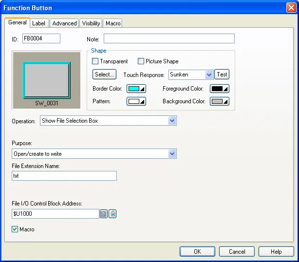
| Function button | One of about a hundred built-in operations: panel setup and brightness, login and logout, show the password table, acknowledge alarms, clear histories, save and load recipe, logged and alarm data to files, change language, print, copy files, start transparent communication, and more. | The Swiss-army object. Many operations take a file extension and an associated object or data logger ID. |
| Word button | Set Constant, Enter Value (keypad), Enter Password, Add, Subtract. | Add and Subtract can be tied to a numeric entry so the operator sees the value change while holding. |
| Multi-state switch | Steps a word through states (button) or lets the operator pick one (list, drop-down, throw-up list). | Text and picture per state. |
| Radio button group, step button | One state per button; or all states shown with the current one highlighted and the next on touch. | |
| Slide switch | A value between a minimum and maximum, written when the knob is released. | Scale page, dynamic range. |
| Keypad button | A character or a command into the keypad buffer. | For building custom keypads on a window screen (Section 5.9.4), selected per entry type on the Custom page of General Setup. |
| Scroll button group, scroll bar | Scroll an associated list object. | Needed by alarm displays, historic tables and recipe tables. |
| Page selector | Shows a chosen window screen as an information page. |
Lamps and message displays (Chapter 6)
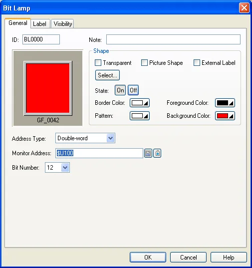
A bit lamp shows one of two appearances from a bit, a word's bit or a double-word's bit. A multi-state lamp shows up to 256 appearances from a word by Value, LSB or Custom state type, each state with its own text, picture and colours. A message display shows one of up to 256 predefined messages from a word, or, with the "value as string number" state type, any of up to 20,000 strings from a text table, which turns a PLC status code straight into readable text; a marquee option scrolls a long message. The difference from a lamp is that a message display is text-first and can draw from the text database, while lamps are shape-first.
Entering and displaying data (Chapter 7)
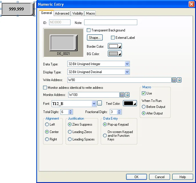
A numeric entry writes a number to a variable through the built-in keypad (decimal, hexadecimal or octal, with a calculator), and a numeric display only shows one. Both take a Data Type (8-, 16- and 32-bit integers, BCD, float), a Display Type (decimal, hex, octal, binary, exponential, IP address) and digit counts. The Advanced page holds the three options that make them useful in practice:
- Scaling: either gain and offset (displayed = raw x gain + offset, and the inverse on entry) or a data min/max mapped to a display min/max. Gain and offset are floats with about 6 significant digits.
- Range check on entries: a value outside the minimum and maximum is refused and the keypad shows the allowed range; with scaling, the output value is what is checked.
- Range display: colour the value differently below a low limit or above a high limit, with fixed or variable limits.
An advanced numeric display adds an arithmetic expression or a macro to compute the displayed value and to convert an entered value, up to 10 colour ranges, a keypad timeout, notification and operator confirmation. Character entries and displays handle ASCII, Western European, Cyrillic and simplified Chinese strings (Unicode on the Windows runtime), with a Pinyin keypad for Chinese. Time, date and day-of-week displays show the panel clock in a choice of formats and need no address at all.
Drawing, pictures and animation
The Draw menu provides dots, lines, polylines, rectangles, circles, ellipses, arcs, pies, polygons, text, pictures, scales and tables (Section 4.1). Shapes can change colour from a control bit, so a static line becomes a pipe that lights when flow is on. Pictures come from the project's Picture Database (BMP, JPG, GIF, WMF, SVG, PNG) and picture groups give an object one picture per state. Chapter 9 of the manual covers the animated objects: pipelines with flowing segments, dynamic lines, rectangles and circles whose position, size and colour come from PLC words, GIF and picture displays, animated graphics that move along a path, and path displays. Use them sparingly on the smaller ARM panels; every animated object is redrawn continuously.
Editing screens quickly
- Shift-click to add to a selection, Ctrl-click to choose the reference object, then Edit > Align and Make Same Size (Section 4.2.4).
- Edit > Duplicate lays out a grid of copies with an address increment, so eight pump buttons on consecutive coils take ten seconds (Section 4.2.3).
- Group objects to move them as one, and save a group to the object library for reuse in other projects.
- The Off and On toolbar buttons preview every object in state 0 or 1; the State box previews higher states.
- The Text Database (Project menu) edits every string of every language in one grid and imports and exports CSV, which is how translations are done (Section 2.2.5).
- Keep one font template per text size and use it everywhere; changing the template changes the whole project (Section 2.2.2).
User levels and passwords
Panel > Passwords (Section 3.8) defines up to 8 user level passwords (positive integers up to 8 digits) plus the developer password as level 9, or up to 32 named users at runtime. Any touchable object can require a minimum user level on its Advanced page and the panel pops up the password keypad automatically when a lower-level operator touches it; the Visibility page can hide objects below a level altogether. A login trigger bit, a logout trigger bit and a login timeout complete the scheme, and $S219 exposes the current level to macros.
Frequently asked questions
What is the difference between a normal screen and a window screen in PM Designer?
A normal (main) screen fills the display and only one is shown at a time. A window screen is smaller and opens on top of the main screen, from a screen button, an alarm, a page selector or the OPEN_WS macro; several can be open together.
How do I make a button that needs a password?
On the button Advanced page tick Enabled by User Level and set the lowest level. Define the level passwords in Panel > Passwords. The panel shows the password keypad automatically when a lower-level operator touches the button.
How do I scale a PLC value for display?
On the Advanced page of a numeric entry or display enable Scaling, either as gain and offset or as a data range mapped to a display range. Entries apply the inverse before writing to the PLC.
Why does my momentary button not register in the PLC?
A quick tap can be shorter than the PLC scan. Set a minimum pulse width on the bit button so the Off is delayed until the pulse is long enough to be seen.
Can one screen be reused on different panel sizes?
Yes. Export it as an SNF file and import it into the other project; positions are kept in pixels, so re-align objects after importing to a different resolution.
Stuck on a Cermate panel?
TSL Automation has supplied and supported Cermate HMIs since 2015. Send us the model, the PM Designer version and a screenshot of the error.
Written by TSL Automation Solutions from the PM Designer user manual and application notes that ship with the software, and from our own support work. Screenshots are from the manual and remain the property of Cermate Technologies Inc. PM Designer and PanelMaster are trademarks of Cermate Technologies Inc. Check your panel's own manual for model-specific limits.