
Section 5.7.4 · Chapter 5: Buttons and Switches
Multistate Switch - General Settings
This section describes how to define the general settings for a multi-state switch. The following is an example of the General page of the Multi-state Switch property sheet.
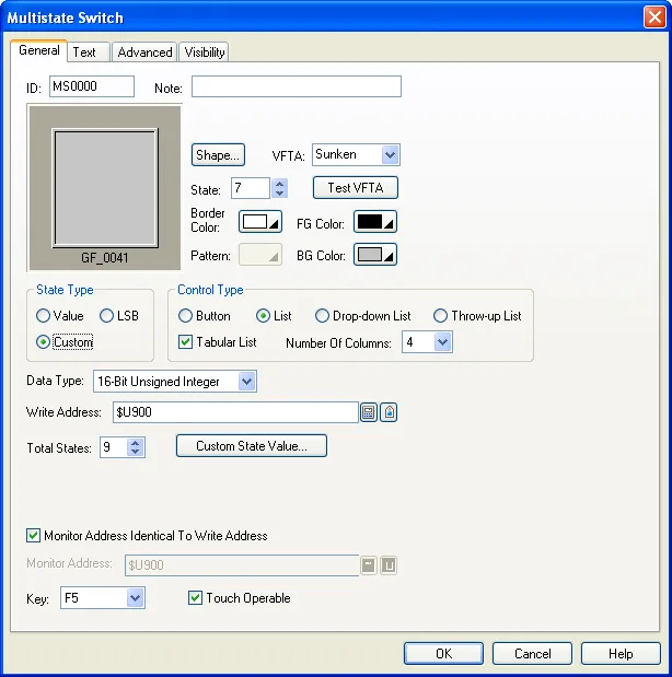
The following table describes each property in the General page.
|
Property |
Description | |
|---|---|---|
| ID | The object’s identifier. It is generated when the object is created. The identifier is unique within the screen where the object is located. The format of the IDs for multi-state switch is MSnnnn. | |
| Note | You can type a note for the multi-state switch. | |
| Shape settings |
For details about the following properties, see
Section 4.3.4 Setting up the Shape of an Object.
Picture Shape,
 ,
VFTA,  ,
Border Color, Pattern, FG Color, BG Color. |
|
| External Label | Check this option if you want the multi-state switch to have an external label. Set up the external label in the External Label page. | |
| State | The current state of the multi-state switch that you can view and set the object appearance for. | |
| State Type | The state type of the monitored variable. There are two options: Value and LSB. For details, see Section 4.4.1.1 State Types. | |
| Control Type | Specifies the control type that the multi-state switch will perform as. There are three types you can choose: Button, List, and Drop-down List, Throw-up List. For details, see Section 5.7.1 Basic Operations. | |
| Tabular List | Check the option if you want the multi-state switch supports tabular list for List, Drop-down List, and Throw-up List. | |
| Number of Columns | Specify the total columns in the tabular list. | |
| Data Type | The data type of the variables specified in this page. | |
| Write Address | Write Address | Specifies the variable to be controlled. |
 |
Click this icon to bring up the Address Input Keypad and specify an address for this property. | |
 |
Click this icon to bring up the Select Tag dialog box and select a tag for this property. | |
| Total States |
Specifies the number of valid states that the monitored
variable has. Note: The last state is state N-1 when the Total States is N. |
|
 |
Click the button to bring up the Custom State Value dialog box to assign a positive integer for each state in the dialog box. Please see details in Section 4.4.1.2 Setting the Custom States of an Object. | |
| Next State | Specifies the method of calculating the next state for the Button control type. | |
| +1 (Wrap) | The next state is the current state plus one when the current state is not the last state. When the current state is the last state, the next state is state 0. | |
| -1 (Wrap) | The next state is the current state minus one when the current state is not state 0. When the current state is state 0, the next state is the last state. | |
| +1/-1 (Retreat) |
With this method, the switch is either in the increasing
mode or in the decreasing mode for the next state
calculation. The switch is in the increasing mode
initially. Assume that the total states of the switch is N. When the switch is in the increasing mode, the next state is the current state plus one, if the current state is not the last state, i.e. state N-1. If the current state is the last state, the switch changes into the decreasing mode, and the next state is the current state minus one, i.e. state N-2. When the switch is in the decreasing mode, the next state is the current state minus one if the current state is not state 0. If the current state is state 0, the switch changes into the increasing mode and the next state is the current state plus one, i.e. state 1. |
|
| +1 (Keep) | If the current state is not the last state, the next state is the current state plus one; If the current state is the last state, the next state keeps at the last state. | |
| -1 (Keep) | If the current state is not state 0, the next state is the current state minus one; If the current state is state 0, the next state keeps at state 0. | |
| Activation | Specifies how the multi-state switch is activated for the Button control type. | |
| Direct | The multi-state switch is activated when the button is touched. | |
| Indirect | The multi-state switch is activated when it is selected, and a function button on the same screen with the operation of “Increase Value By One” or “Decrease Value y One” is touched. | |
| Monitor Address identical to Write Address | Specifies that the Monitor Address is identical to the Write Address. With this item checked, you don’t need to specify the same variable for the Monitor Address field. | |
| Monitor Address | Monitor Address | Specifies the variable to be monitored. |
|
|
Click this icon to bring up the Address Input Keypad and specify an address for the Monitor Address field. | |
|
|
Click this icon to bring up the Select Tag dialog box and select a tag for the Monitor Address field. | |
| Key | The hard key that is used to operate the multi-state switch. This item is available when the target panel has hard keys. | |
| Touch Operable | Check this option if you want the button is still operable by using the touch panel even it is configured to be operated by the key. | |
Need PM Designer itself?
V4 for current PK, PT, ITV and PM panels, V2 for older models. Free, sent by email.
Source.Section 5.7.4 of the PM Designer Software User Manual, Edition 2.0, © Cermate Technologies Inc. (www.cermate.com, service@cermate.com). Reproduced online, with the manual's own figures, by TSL Automation Solutions, authorised Cermate distributor, for users of Cermate HMI panels. PM Designer and PanelMaster are trademarks of Cermate Technologies Inc.
Text and figures are the manufacturer's and may describe features your panel or software version does not have. For a plain-language introduction read the PM Designer guide; for help with a specific panel contact TSL Automation.