
Section 4.3.4 · Chapter 4: Designing Screens
Setting up the Shape of an Object
This section describes how to set the shape of an object.
In order to give the operator visual feedback for the touch action, most of the
graphical shapes designed for touch operable objects can change their look when
touched. The edge or border can look pressed or the outline can be shown with a
different color.
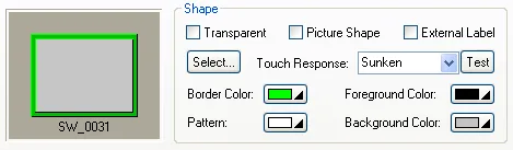
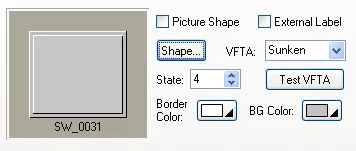
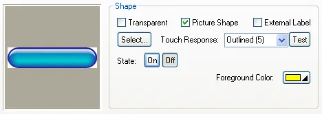
The following examples are the shape settings of a bit button:
|
Example 1 |
Example 2 |
|---|---|
| The graphical shape SW_0031 is selected. | The graphical shape is a picture. |
  |
 |
The following table describes each property that may be required for the settings of an object’s shape.
|
Property |
Description | |
|---|---|---|
| Transparent | Select this option if you want the object to have a transparent background. | |
| Picture Shape | Check this option if you want the object to have a picture shape instead of a graphical shape. This option is available when the object can have a picture shape. | |
 /  |
Click this button to specify the shape of the object. When Picture Shape is checked, the Select/Import from Library dialog box will display. Otherwise, the Shape palette will display. | |
| Touch Response / VFTA |
The type of touch response / VFTA (Visual Feedback
for Touch Action). There are 5
types : (None); Sunken; Back; Outlined (1); Outlined (5). If Outlined(1) or Outlined(5) is selected, it will outline the bounding rectangle of a button with 1 or 5 pixel(s) thickness and the Foreground Color of state 0 when the button is pressed. |
|
 /  |
Click this button to view the selected touch response / VFTA. | |
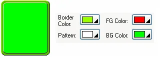
| Border Color | The border color of the graphical shape. Click the corresponding Color icon to specify the color. | |
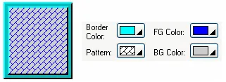
| Pattern | The pattern that is used to fill the area inside the border of the graphical shape for the current (object) state. To specify the pattern, click the corresponding Pattern icon and select a pattern from the Pattern palette. This item is available when the area inside the graphical shape needs be painted. | |
| Foreground Color / FG Color | The color that is used to paint the black part of the pattern for the current (object) state. When the solid white pattern is selected, this color is not used. When a picture shape is used, this color is used for the outline mode with touch response. | |
| Example 1 | Example 2 | |
 |
 |
|
| To specify the color, click the corresponding Color icon and select a color from the Color palette. This item is available when the area inside the graphical shape needs be painted. | ||
| Background Color / BG Color | The color that is used to paint the white part of the pattern for the current object state. To specify the color, click the corresponding Color icon and select a color from the Color palette. This item is available when the area inside the graphical shape needs be painted. | |
Need PM Designer itself?
V4 for current PK, PT, ITV and PM panels, V2 for older models. Free, sent by email.
Source.Section 4.3.4 of the PM Designer Software User Manual, Edition 2.0, © Cermate Technologies Inc. (www.cermate.com, service@cermate.com). Reproduced online, with the manual's own figures, by TSL Automation Solutions, authorised Cermate distributor, for users of Cermate HMI panels. PM Designer and PanelMaster are trademarks of Cermate Technologies Inc.
Text and figures are the manufacturer's and may describe features your panel or software version does not have. For a plain-language introduction read the PM Designer guide; for help with a specific panel contact TSL Automation.