
Section 4.1.5 · Chapter 4: Designing Screens
Drawing Circles
- In the Draw menu or Draw toolbar, click Circle
 to draw a circle.
- Move the cursor onto the screen where you want to draw a circle. A circle with default settings will display and move along with the cursor.
- Click the desired position on the screen to place the circle. The center of the circle will be at the clicked position.
- Position the mouse pointer over the handle on the edge of the circle. When the cursor changes to or , drag the handle until the circle is the size you want.
- Position the mouse pointer over the handle on the center of the circle. When the cursor changes to , left-click the center and hold down the button to move the circle.
|
|
The picture on the left shows the two handles of a circle. |

-
Double-click the circle to bring up the Circle dialog box to modify the settings of the circle.
The following is a sample of the Circle dialog box.
|
|
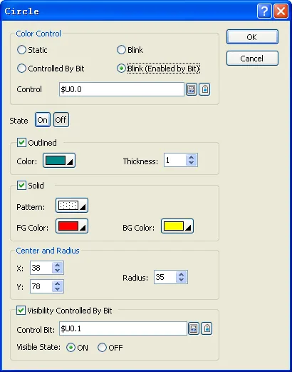 |

The following table describes each property in the Circle dialog box.
|
Property |
Description | |
|---|---|---|
| Color Control | Static | Check this option if the color of the circle will not be changed. |
| Controlled By Bit | Check this option if the color of the circle will be controlled by the specified bit. | |
| Blink | Check this option so the circle will blink. You have to choose the blink effects that change the color of the circle from its On state Outlined and Solid option settings to Off state Outlined and Solid option settings. | |
| Blink (Enabled by Bit) | Check this option if you want to enable the circle blinking by the specified bit. | |
| Control Bit |
Specifies the bit or the word's bit that controls the color or enables the
color blinking. Click  to enter the bit address. Click  to enter the bit tag. |
|
| State | Select the state that you want to view or define the colors for. | |
| Outline | Outlined | Check this option if you want the circle to be outlined. |
| Color | Specifies the outline color for the selected state. | |
| Thickness | Specifies the thickness of the outline. | |
| Solid | Solid | Check this option if you want the circle to be solid. A solid circle is filled with the specified pattern and colors. This field is available when Border is selected. |
| Pattern | Specifies the fill pattern for the selected state. | |
| FG Color | Specifies the color for the selected state that will be used for painting the black part of the fill pattern. | |
| BG Color | Specifies the color for the selected state that will be used for painting the white part of the fill pattern. | |
| Center & Radius | X | The X coordinate of the center of the circle. |
| Y | The Y coordinate of the center of the circle. | |
| Radius | The radius of the circle. | |
| Visibility Control | Visibility Controlled By Bit | Check this option if the circle will be shown or hidden by the specified bit. |
| Control Bit |
Specifies the bit that shows or hides the circle.
Click
to enter the bit address. Click
to enter the bit tag. |
|
| Visible State | Specifies the state (On or Off) that makes the circle visible. | |
- You can click the following icons in the Draw toolbar to modify the properties of the circle.
|
Click Icon |
To |
|---|---|
 |
Select a color for the outline. |
 |
Select a color for painting the white part of the fill pattern. |
 |
Select a pattern for the fill pattern. |
 |
Select a color for painting the black part of the fill pattern. |
Need PM Designer itself?
V4 for current PK, PT, ITV and PM panels, V2 for older models. Free, sent by email.
Source.Section 4.1.5 of the PM Designer Software User Manual, Edition 2.0, © Cermate Technologies Inc. (www.cermate.com, service@cermate.com). Reproduced online, with the manual's own figures, by TSL Automation Solutions, authorised Cermate distributor, for users of Cermate HMI panels. PM Designer and PanelMaster are trademarks of Cermate Technologies Inc.
Text and figures are the manufacturer's and may describe features your panel or software version does not have. For a plain-language introduction read the PM Designer guide; for help with a specific panel contact TSL Automation.