
Section 4.3 · Chapter 4: Designing Screens
Designing Object Appearance
There are four common components of object appearance. They are described in the following table:
|
Appearance Component |
Description | |
|---|---|---|
| Shape |
The shape of an object can either be a graphical shape
or a picture shape. The following are examples of graphical shapes:  The following are examples of picture shapes:  The software provides many graphical shapes for you to choose from. For details, see Section 4.3.3 Selecting a Graphical Shape. The color or the pattern of a graphical shape is dependent on the state of the associated object. You need to specify the color or pattern settings of a graphical shape for each state of the associated object. For details, see Section 4.3.1 Selecting a Color and Section 4.3.2 Selecting a Pattern. If you want an object to have a picture shape, check the item Picture Shape in the General Page of the object’s property dialog box. You can select a picture from the picture database or import a picture from a library file for the shape of an object. Any picture with the format of BMP, JPG, or WMF can be a picture shape. When a picture is used as a shape, the shape is state independent, i.e. the same look appears for all (object) states. If you want a picture shape to display the object state and/or show the touch action, you need to select a picture group as the shape. For details of picture groups, please see Section 2.2.3.2 Picture Groups. To know how to set a shape, see Section 4.3.4 Setting up the Shape of an Object. |
|
| Inner Label |
An inner label is a label inside the associated object.
It has the same number of states as the associated
object. You need to specify the text settings and the
picture settings of an inner label for each (object)
state. Inner labels are language dependent. You need to
specify the text of an inner label for each language as
well. Note that not all objects can have inner labels
and some objects can have just text or a picture as
their inner label. To know how to set an inner label, see Section 4.3.5 Label Settings. |
|
| VFTA (Visual Feedback for Touch Action) | A button or switch can give the operator one of the following visual feedbacks when it is touched: | |
| Visual Feedback | Description | |
| Sunken | Shifts the inner label to the lower-right corner by one or two pixels. | |
| Back | Fills the area inside the border of the shape with the shape’s FG Color. | |
| Outline | Outlines the object with the shape’s FG Color. | |
| External Label |
An external label is a label outside of but still
attached to the associated object. Unlike inner labels,
external labels are state independent. They have the
same look for all (object) states. However, external
labels are language dependent. You need to set the text
of an external label for each language. External labels
are touch insensitive. Touching an external label will
not activate the associated object. Note that not all
objects can have an external label. To know how to set an external label, see Section 4.3.8 External Label Settings. |
|
The following table shows the common appearance components that each object type can have:
|
Object Types |
Shape | Inner Label | VFTA | External Label | ||
|---|---|---|---|---|---|---|
| Graphical Shape | Picture Shape | Text | Picture | |||
|
Bit Button, Toggle Switch, Screen Button, Word Button,
Multi-state Switch, Radio Button Group |
● | ● | ● | ● | ● | ● |
| Function Button, Keypad Button, Page Selector | ● | ● | ● | ● | ● | |
| Step Button | ● | ● | ● | ● | ● | |
| Bit Lamp, Multi-state Lamp | ● | ● | ● | ● | ● | |
| Message Display | ● | ● | ● | |||
| Picture Display | ● | ● | ● | |||
| Day-of-week Display | ● | ● | ||||
| Meter | ● | ● | ||||
| Slide Switch, Numeric Entry, Numeric Display, Advanced Numeric Display, ASCII Character Entry, ASCII Character Display, Bar Graph | ● | ● | ||||
| Time Display, Date Display, Pie Graph, Line Chart, Scatter Chart, Alarm Display, Historic Data Display, Historic Trend Graph, Single Record Line Chart, Operation Log Display, Recipe Selector, Recipe Table, Sub-link Table, Static Text, Table | ● | |||||
| Animated Graphic | ● | |||||
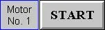
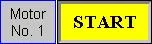
The orders of drawing the common appearance components are shown in the
following table with examples:
|
Step |
Draw | Example 1 | Example 2 | Description |
|---|---|---|---|---|
| 1 | Shape |
 |
 |
Described in Section 4.3.4. |
| A picture group that supports the pressed look | A graphical shape named SW_0023 | |||
| 2 | Picture of Inner label |
 |
(None) | Described in Section 4.3.5.2. |
| 3 | Text of inner label |
 |
 |
Described in Section 4.3.5.1. |
| 4 | VFTA | (None) |
Back (FG Color is
 ) |
|
| 5 | External label | (None) |
 |
Described in Section 4.3.8. |
| Final Appearance (When untouched) |
 |
 |
||
| Final Appearance (When touched) |
|
 |
||
In this section
Need PM Designer itself?
V4 for current PK, PT, ITV and PM panels, V2 for older models. Free, sent by email.
Source.Section 4.3 of the PM Designer Software User Manual, Edition 2.0, © Cermate Technologies Inc. (www.cermate.com, service@cermate.com). Reproduced online, with the manual's own figures, by TSL Automation Solutions, authorised Cermate distributor, for users of Cermate HMI panels. PM Designer and PanelMaster are trademarks of Cermate Technologies Inc.
Text and figures are the manufacturer's and may describe features your panel or software version does not have. For a plain-language introduction read the PM Designer guide; for help with a specific panel contact TSL Automation.