
Section 3.2.4 · Chapter 3: Creating Panel Applications
Usage Settings for a Key
You can assign or change the usage for the key or the key combination with the Usage Setup Dialog. The Usage Setup Dialog is a floating dialog box that can be freely moved.
To open the Usage Setup Dialog, left-click the cell in the key usage table. If the selection in the key usage table is changed, the dialog box remains open and displays the settings related to the new selection.
The following is an example of usage setup dialog.
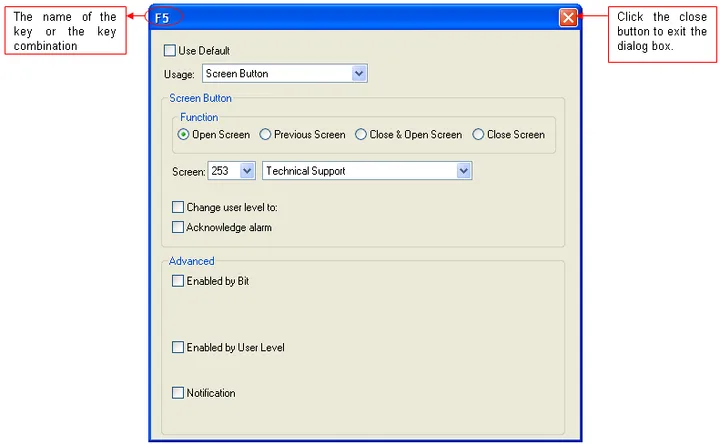
|
Property |
Description | ||||||
|---|---|---|---|---|---|---|---|
| Use Default | Check this option if you want to use the default setting in the Keys page of the General Setup property sheet. The field is only available in the Keys page of the Screen Properties property sheet. | ||||||
| Usage | Select a usage for the key or key combination. There are 7 options: None, Bit Button, Function Button, Keypad Button, Multistate Switch, Screen Button and Word Button. | ||||||
| Bit Button | If the usage is Bit Button, specify the following properties: | ||||||
| Property | Description | ||||||
| Function |
Select the operation of the bit button. There are 5
options: Set ON, Set OFF, Momentary ON, Momentary OFF,
and Invert. For details, see Section 5.1.1 Basic Operations. |
||||||
| Write Address |
Specifies the bit variable to be operated.
Click  to enter an address for this field. Click  to select a tag for this field. |
||||||
| ON Macro | Check this option for the button to have an ON macro. Select a macro from the dropdown list. This option is available when the bit button operation is Set ON, Momentary ON, or Momentary OFF. | ||||||
| OFF Macro | Check this option for the button to have an OFF macro. Select a macro from the dropdown list. This option is available when the bit button operation is Set OFF, Momentary ON, or Momentary OFF. | ||||||
| Function Button | If the usage is Function Button, specify the following properties: | ||||||
| Property | Description | ||||||
| Function | Specifies the operation for the function button to perform. About the available operations, see Section 5.4.1 Basic Operations. | ||||||
| Keypad Button | If the usage is Keypad Button, specify the following properties: | ||||||
| Property | Description | ||||||
| Enter Character | Select this item if the button is used to input specified character to the keypad buffer. | ||||||
| Character | Available when Enter Character is selected. Specifies the character to be entered in the keypad buffer. | ||||||
| Enter Command | Select this item if the button is used to issue the specified command to the keypad buffer. | ||||||
| Command | Available when the Enter Command is selected. Specifies the command issued to the keypad buffer. There are 4 commands available: | ||||||
| Command | Description | ||||||
| Enter | Completes the data entry and sends the input string to the associated object or the system. | ||||||
| Escape | Cancels the data entry operation. | ||||||
| Clear | Clears the keypad buffer. | ||||||
| Backspace | Removes the last character in the keypad buffer. | ||||||
| Multistate Switch | If the usage is Multistate Switch, you need to specify the following properties: | ||||||
| Property | Description | ||||||
| State Type | The state type of the monitored variable. There are 2 options: Value and LSB. For details, see Section 4.4.1.1 State Types. | ||||||
| Data Type | The data type of the variables specified in this page. | ||||||
| Write Address |
Specifies the variable to be controlled.
Click
to enter an address for this field. Click
to select a tag for this field. |
||||||
| Total State |
Specifies the number of valid states that the monitored
variable has. Note: The last state is state N-1 when the Total States is N. |
||||||
| Next State |
Specifies the method of calculating the next state.
+1 means the next state is the current state plus one, when the current state is not the last state. When the current state is the last state, the next state is state 0. -1 means the next state is the current state minus one, when the current state is not state 0. When the current state is state 0, the next state is the last state. |
||||||
| Screen Button | If the usage is Screen Button, specify the following properties: | ||||||
| Property | Description | ||||||
| Function | Specifies the operation for the screen button to perform. There are 4 options: Open Screen, Previous Screen, Close and Open Screen, and Close Screen. For details, see Section 5.3.1 Basic Operations. | ||||||
| Screen | Specifies the screen to be opened. | ||||||
| Change user level to |
Check this option for the button to change the current
user level. Specify the new user level to replace the current user level. |
||||||
| Acknowledge alarm | Check this option for the button on the alarm-associated screen to acknowledge the alarm. | ||||||
| Word Button | If the usage is Word Button, you need to specify the following properties: | ||||||
| Property | Description | ||||||
| Function | Specifies the operation that the word button performs. For details, see Section 5.6.1 Basic Operations. | ||||||
| Data Type | The data type of the variable to be controlled. | ||||||
| Write Address |
Specifies the variable to be controlled.
Click
to enter an address for this field. Click
to select a tag for this field. |
||||||
| Constant | The constant for the specified operation. | ||||||
| Minimum | The minimum for the specified operation. | ||||||
| Maximum | The maximum for the specified operation. | ||||||
| Total Digits | The number of digits to be displayed for the Minimum and the Maximum on the numeric keypad. | ||||||
| Fractional Digits |
When the Data Type is 32-bit Floating Point, this
property specifies the number of fractional digits to be
displayed for the Minimum and the Maximum on the numeric
keypad. When the Data Type is not 32-bit Floating Point, this property specifies not only the number of fractional digits to be displayed, but also the number of least significant digits to be displayed as the fractional part. With this feature, an integer can be shown and entered as a fixed point number. When the Fractional Digits is nonzero, say N, the entered value will be converted to an integer according to the following formula before being output. OutputValue = EnteredValue * (Nth power of 10) Example: |
||||||
| Display Type | Total Digits | Fractional Digits | Entered Value | Output Value | |||
| 32-bit Floating Point | 4 | 2 | 12.34 | 12.34 | |||
| 32-bit Floating Point | 4 | 2 | 123.4 | Error! | |||
| 16-bit Signed Decimal | 5 | 2 | 123.45 | 12345 | |||
| 16-bit Signed Decimal | 5 | 2 | -0.05 | -5 | |||
| 16-bit Signed Decimal | 5 | 2 | 3 | 300 | |||
| Activation | Select Button Down item so the touch operation will be activated when the button is touched. Select Button Up item so the touch operation will be activated when the button is released. | ||||||
| Advanced | The following table describes each Advanced property. Not all properties are available for each object. | ||||||
| Property | Description | ||||||
| Enabled by Bit | Check this option so the operation of the object will be enabled and disabled by the specified bit. | ||||||
| Bit |
Specifies the bit that enables and disables the touch
operation. Click
to enter a bit address. Click
to select a bit tag. |
||||||
| Enabling State | Specifies the state (On or Off) that enables the touch operation. | ||||||
| Enabled by User Level | Check this item so the touch operation of the object will be enabled and disabled by the current user level. | ||||||
| Lowest Enabling User Level | Specifies the lowest user level that is required to enable the touch operation. | ||||||
| Operator Confirmation | Check this option if you want the operator to confirm the operation. The Confirmation box will be displayed when the object performs the operation. If the operator selects “Yes” in the Confirmation box, the operation will be performed. If the operator selects “No” or the operator does not respond within the specified time period (Maximum Waiting Time), the operation will be cancelled. | ||||||
| Maximum Waiting Time | Specifies the maximum time that the object will wait for the operator’s confirmation. The operation will be cancelled if the operator does not respond within this time. | ||||||
| Notification | Check this option so the object will notify the specified bit after it finishes the operation. | ||||||
| Bit | Specifies the bit that receives the notification. | ||||||
| State | Specifies the state (On or Off) that is used for the notification. | ||||||
Need PM Designer itself?
V4 for current PK, PT, ITV and PM panels, V2 for older models. Free, sent by email.
Source.Section 3.2.4 of the PM Designer Software User Manual, Edition 2.0, © Cermate Technologies Inc. (www.cermate.com, service@cermate.com). Reproduced online, with the manual's own figures, by TSL Automation Solutions, authorised Cermate distributor, for users of Cermate HMI panels. PM Designer and PanelMaster are trademarks of Cermate Technologies Inc.
Text and figures are the manufacturer's and may describe features your panel or software version does not have. For a plain-language introduction read the PM Designer guide; for help with a specific panel contact TSL Automation.